
Interface age is measured in seconds, not release notes. A Mac window announces its vintage before a user clicks anything, and the signals that give it away are structural rather than stylistic. The eight trends below describe where desktop interface design is heading: spatial depth, translucent materials, context-aware theming, dynamic typography, purposeful micro-interactions, tactile feedback, data-dense layouts, and keyboard-first navigation. Each one is examined here through how teams actually shipped it.
Two Seconds, Give or Take, to Look Abandoned
One small Mac team sorted six weeks of inbound support correspondence, late September through early November 2024, before anyone opened a design critique. Categorizing that mail surfaced a pattern: the loudest complaints clustered around surfaces rather than missing capability. A visible seam between title bar and toolbar. A sidebar that stopped short of the window controls instead of running under them. Chrome that predated the unified toolbar entirely.
Applications still shipping that chrome read as abandoned within the first two seconds, give or take, before a single feature gets exercised. That is a retention problem wearing a cosmetic costume, and it responds to sequencing.
Sprint Order That Works — Fix material and accent inheritance first, roughly one to two sprints. Move to theming tokens next, three to five weeks. Motion and keyboard layers come last, because both depend on the token work being finished before they can be built cleanly.
Three Z-Planes and Nothing More
Spatial UI has walked out of headsets and into desktop window management, and the teams handling it well treat depth as a budget rather than a finish. One approach that holds up: fix three z-planes for the entire application. Window chrome and sidebar occupy the back plane. Content surfaces sit on the middle plane. Transient elements, popovers, the command palette, drag proxies, live on the front plane. The standing rule is that any new component claims an existing plane instead of inventing a fourth, with shadow values derived from the plane rather than chosen per component.
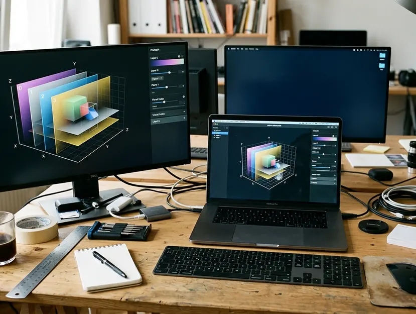
The ceiling is a compositing ceiling. Blurred materials were restricted to the sidebar and overlay planes only, because stacking translucent surfaces more than two deep on an external 5K panel pushed frame time past roughly 8 ms, the threshold required to hold 120 Hz. The failure shows up as stutter during window resize, never during idle, which is exactly why it survives design review.
Legibility gets verified against the worst case instead of the design file. Text over a vibrant material is checked against a bright saturated desktop picture and a pure white one, holding a 4.5:1 contrast floor in both. Every translucent surface ships with a fully opaque counterpart bound to Reduce Transparency, tested by toggling the setting while the window is open rather than only at launch. Apple's native rendering guidelines set the vocabulary; the panel and the accessibility toggle set the limits.
Depth layering earns its keep in windows hosting genuinely distinct regions: a source list, an editing canvas, an inspector. Drop the same treatment into a single-column utility with one content area and it reads as decoration, with the shadows only making the window feel heavier.
Forty Tokens Against Several Hundred Hex Literals
Theming stopped being a dark mode toggle some time ago. It now adapts contrast and saturation to ambient light and time of day, and that only becomes tractable when color stops living in the codebase as literals.
The rebuild ran in two passes. The first inventoried every hardcoded color value and mapped it to a small set of semantic roles: surface, surface-raised, separator, text-primary, text-secondary, accent, accent-pressed, destructive. The appearance switch became a lookup instead of a branch. A mid-sized Mac app landed on roughly 40 semantic tokens resolving into two appearance ramps, replacing an audit that had turned up several hundred distinct hex literals, most of them near-duplicates separated by a step or two.
The second pass governed transition. Ambient and time-of-day adjustments ramp over a 15 to 20 minute window rather than snapping, with contrast raised and saturation pulled back at the dim end so accent colors stop glowing in a dark room.
Typography follows the same logic at three window-width thresholds, approximately 620 pt, 900 pt, and 1240 pt. Body weight shifts one step, and tracking tightens slightly at the widest step, where line lengths grow and letterforms otherwise start to look loose.
The Double-Keystroke Test
Animation is doing structural work now, carrying state transitions and guiding attention. An early build gave panel expansion a 400 ms spring with a visible overshoot. It demoed beautifully. It lasted two weeks of internal use, because keyboard users hitting expand-collapse in rapid succession would fire the shortcut again mid-bounce and land in the opposite state from the one they expected. The replacement is a shorter, non-overshooting curve that accepts a new target while still in flight.
Motion Under Arrest — Press an expand-collapse shortcut twice inside a quarter second. If the final panel state disagrees with the number of presses, the animation is holding the app hostage. Bring it under 180 ms or cut it.
State transitions standardize at 120 to 180 ms, with 240 ms reserved for full-panel or sheet movement. Anything longer gets filed as a bug rather than defended as a style choice. Cursor-proximity feedback begins around 20 to 24 pt from a control's bounds and resolves into the full hover state on contact, which gives toolbar rows a sense of anticipation without lighting up during ordinary cursor transit. Press feedback uses a 1 pt inset plus a shadow reduction; a scale transform resamples text and blurs it on non-Retina external displays.
Compact Rows, Comfortable Rows, and a Palette
Density came from counting, not from a style guide. The team measured how many list rows fit in a half-screen window on a 13-inch laptop at each candidate height, then set the compact default where a full working set stopped requiring scrolling. Two modes ship: a 24 pt compact row, default for list-heavy screens, and a 32 pt comfortable row for preferences and setup flows. Whitespace was reallocated rather than deleted.
Keyboard-first navigation carries the other half. The command palette has to present results within the same frame as the keystroke, targeting under 16 ms for the filter pass across several hundred commands. That budget rules out re-sorting the full set on every character and pushes the implementation toward incremental narrowing.
The ethos traces to the mid-2010s generation of Mac companion apps built for web-based project tools: one window, no launch animation, no onboarding modal, and a first screen that shows work instead of welcome copy.
Pick the Screen by Evidence, Then Run the Pass
Choose the target screen from logs, not memory. Record which window sits frontmost across ten consecutive working days, or, with opt-in analytics available, take the screen with the highest daily open count rather than the highest total time. The screen people return to constantly is the one worth restructuring.
Timebox The Audit — Budget 90 minutes for the keyboard-only pass and about 30 minutes to write up every blocked step. Push past that and the output turns into fatigue notes instead of design notes.
Two more passes on the same screen. For spatial hierarchy, find one region currently separated only by a hairline rule, an inspector, a filter bar, a footer summary, and test whether promoting it to a raised plane with a single shadow step clarifies what belongs to what. For the palette, set a first target of every verb reachable from the menu bar on that screen, plus direct navigation to its top-level sections, with no more than one nested level in the results list.
Start the frontmost-window log tomorrow morning. On day eleven, block the 90 minutes, unplug the mouse, and work that screen with the keyboard alone until the list of blocked steps is written down.








Comments
No comments so far.
Join the Discussion