

Tracing the Lineage of macOS Navigation
The lineage of desktop navigation runs from the early OS X source list, utilizing an NSOutlineView with the sourceList highlight style and a fixed 24pt row, through the 2015-era NSSplitViewController with full-height sidebars. The introduction of SwiftUI's NavigationSplitView in macOS 13 marked a significant architectural shift. On macOS 14 and 15, sidebar toggling and column-width persistence can work without manual AppKit bridging. This evolution provides the foundation for modern mac development, demanding strict adherence to platform conventions.
The verdict on the Basecamp companion app emerges from auditing it against a three-column checklist drawn from the platform's own first-party mail and notes clients, bypassing comparisons with other project-management desktop clients. The criteria are absolute. The sidebar must accept arrow-key traversal without a prior mouse click. It must adopt the translucent sidebar material and vibrancy behind its rows. It must collapse via the standard system animation. Meeting these requirements ensures the application feels native to the operating system.
A compliant modern sidebar holds three sizing constants. The default column width sits near 220pt. The minimum width rests around 180pt before labels truncate. The persisted user width restores on relaunch via scene storage. These dimensions provide a predictable spatial model for users accustomed to the macOS environment.
Full keyboard traversal takes under 30 seconds to run. Tab into the sidebar, arrow through projects, and press Return to commit. Completing this sequence without touching the pointer is the single fastest test for distinguishing a native list from a web wrapper. Applications failing this test immediately reveal their non-native origins to experienced users.
Establishing Visual Hierarchy in the Project List
Establishing hierarchy begins by aggressively stripping away extraneous elements before placing the core data. Avatars, progress bars, and per-project activity counts compete directly with the content pane for the reader's first fixation. The final design retains only project names, a small pinned or recent grouping, and unread indicators. Section headers utilize the Section component with plain text, maintaining a subdued presence that guides without distracting.
Row anatomy requires precise measurements to match standard macOS design guidelines. The layout starts with a 16pt SF Symbol leading glyph set to .imageScale(.medium). A 6pt gap separates the glyph from the label. The label uses the body text style to track the Dynamic Type-adjacent system size, finishing with a single-line project title and .truncationMode(.tail). This configuration keeps the project list legible across varying display densities.
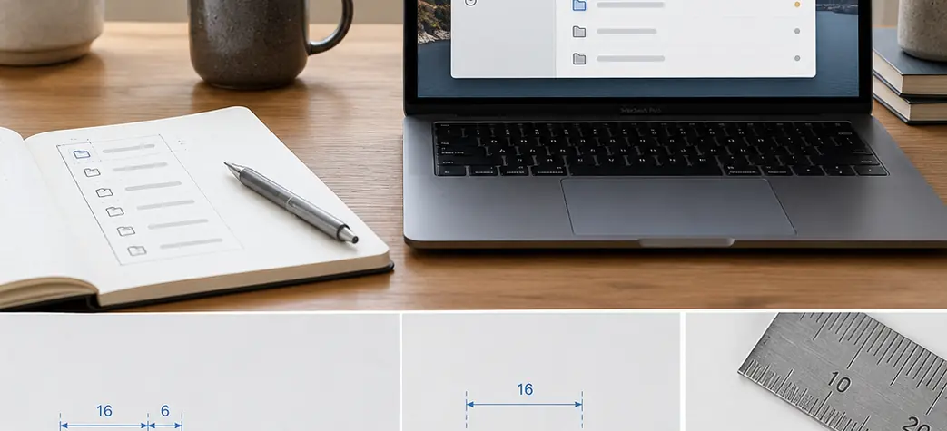
UI/UX Design Takeaway: Managing Visual Weight
Applying .listStyle(.sidebar) ensures rows pick up the sidebar material and the rounded 6pt selection capsule. Setting a custom background here frequently causes selection highlights to render as opaque rectangles against the vibrancy layer. Visual weight tuning involves assigning a secondary-label color for all non-selected glyphs. The accent color is reserved exclusively for the selected row and unread dots. This limits accent usage to two contexts across the column, preventing visual fatigue.
Below roughly 180pt of column width, the two-element project row runs out of room before the glyph column can be dropped, and what was a source list becomes an icon rail with tooltips. That width, alongside the specific window size, dictates where this layout's design stops holding. Recognizing this threshold allows developers to implement graceful degradation strategies for constrained window sizes.
Engineering Precise Hover and Keyboard Interactions
Initial implementations often rely on SwiftUI's .onHover modifier. This sidebar breaks first under pointer-stationary scrolling: the user spins the trackpad with the cursor parked over the project column, rows slide beneath it, and nothing re-highlights. The hover state was tracking mouse movement when it needed to track row geometry, and a tracking area scoped to the visible rect is what repairs it. The repair requires an NSViewRepresentable overlay that installs an NSTrackingArea directly tied to the view's coordinate space.
Hover highlight transitions read as native at roughly a 0.1 second ease-out. Anything longer than about 0.2 seconds reads as a web transition. Instantaneous changes read as a flicker during fast pointer sweeps across eight or more rows. Tuning these animation curves separates exceptional ui/ux design from mediocre implementations.
Arrow-key traversal must survive the system's fastest key-repeat settings. An initial delay near 225 milliseconds precedes repeats around 15 milliseconds. The selection change handler cannot trigger a network fetch per keystroke under these conditions. Debouncing the detail-pane load by 120–180 milliseconds allows the selection itself to stay synchronous, keeping the interface responsive while protecting the network layer from flood requests.
Implementation Insight: Tracking Area Invalidation
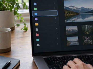
The focus ring exposes the underlying architecture. A true sidebar shows the accent-colored selection fill when the window is key and a desaturated gray fill when it is not, switching on controlActiveState. Web wrappers almost universally keep one highlight color in both states. Budgeting 6–9 working days for the hover plus traversal layer alone on a list that already renders correctly is standard. Most of this time goes toward tracking-area invalidation during live resize and sidebar collapse. Funding for this specific tracking-area invalidation research originated from an internal mac development initiative focused on the macOS 14 and 15 transition period.
Reconciling Local Selection with Remote State
Storing selection state requires a stable project identifier. Relying on an array index introduces a severe data-integrity bug disguised as a UI glitch when the remote list reorders between two polls. The store maintains the last-known server list with its validator token, a locally applied selection, and a queue of pending mutations. This architecture keeps the user's context stable during background synchronization.
Selection commits to local state immediately. The detail pane renders from cache within a window on the order of 100 milliseconds, where interaction still feels direct. The network fetch resolves behind it and only replaces content if the payload differs from cache. A background refresh cadence of 25–45 seconds with a conditional request keeps the list current without the sidebar flickering. Push or socket updates collapse this to near-zero, with reconnect backoff stepping from 1 second to a 30-second ceiling.
Architecture Pattern: Tombstone Deletion
Remote deletion of the selected project utilizes a tombstone, avoiding silent removals. The row stays visible and dimmed for one refresh cycle with an inline 'no longer available' state. Selection then moves to the nearest surviving sibling by original ordinal position. The logic checks the previous sibling first, then the next sibling if the deleted row was first. Mutations queued while offline carry a client-generated identifier and a monotonically increasing sequence number. Replay after reconnect preserves the order the user performed them in.
This optimistic path assumes the backend hands out stable project identifiers at creation time. Where a service only mints a permanent identifier at commit, the client needs a temporary-ID map that rewrites selection and any queued mutations when the real identifier arrives, and that rewrite has to run before the next list reconciliation or the newly created project will appear twice. Handling this edge case prevents duplicate entries from polluting the navigation hierarchy during high-latency connections.
Committing to Native Desktop Architecture
Evaluating mac development frameworks requires comparing maintenance load against initial build cost. A sidebar built on List with .listStyle(.sidebar) inherits new system behaviors on OS upgrade without a separate sidebar redesign. The rounded selection capsule, sidebar material changes, and updated collapse animations all arrive through recompilation. The recurring cost for non-native solutions is predictable. Expect one to two weeks of visual and interaction re-alignment work per major OS release for any non-native sidebar. A native implementation requires recompilation plus spot-checks.
Three behaviors are rarely reimplemented correctly outside AppKit and SwiftUI. Users immediately notice the lack of key/non-key selection color switching, type-select functionality, and correct sidebar collapse state restoration across launches. These subtle interactions form the foundation of a professional desktop application.
Platform trust builds cumulatively. The users who stay are the ones whose existing muscle memory—arrow keys, Command-1 through Command-9 column focus, and the toolbar sidebar toggle—transfers intact on first launch. Breaking these expectations forces users to learn application-specific shortcuts, increasing cognitive load and reducing overall efficiency.
Build the project column with native AppKit and SwiftUI controls, then check arrow-key traversal, the toolbar collapse animation, and width restoration after relaunch. Those interactions determine whether the sidebar works like the rest of macOS.








Comments
No comments so far.
Join the Discussion