

For most of two decades, the company behind Basecamp treated the browser as the only runtime worth supporting. Then the Dock icons appeared. The release of Mac companions for Basecamp and HEY marked a shift in this long-held strategy, defined by strict discipline in what the design team chose to leave out.
From Web Purists to a Dock Icon That Earns Its Place
The argument against native wrappers was always a design argument. A browser tab is disposable. It carries no state, demands no updates, and never asks a user to manage a second copy of their software. Holding that line kept the product surface small.
Persistent workflows broke the position. Screening email in HEY and monitoring a dozen active project threads in Basecamp are not tab-sized activities; they are all-day activities that compete with Slack, Mail, and Messages for a slot in the Dock and a line in Notification Center. A tab loses that competition every time.
Getting there took real engineering. Stabilizing the WebKit integration ran an eight to twelve month development cycle before the shell behaved like a Mac application rather than a browser in a costume. The payoff shows up on disk: because the apps defer to native system settings instead of shipping their own sprawling preference panes, the installed footprint stays under 150 megabytes.
That restraint is the verdict. Both companions succeed by refusing to rebuild what macOS already provides. There is no custom notification engine, no proprietary alert scheduler, no bespoke sound library. Configuration happens where Mac users already expect it to happen.
Three pillars carry the rest of this guide: account and workspace separation, notification scoping through the system, and keyboard navigation.
Two Workspaces, One Dock, No Crossed Wires
Adding a second account in either app takes a trip to the account menu and a standard sign-in. From that point forward, switching requires no logout cycle. Each workspace lives in its own window with its own history.
The mechanism underneath matters more than the menu item. Session tokens are isolated inside distinct WebKit instances, which is why a cold switch between two active workspaces costs two to three seconds rather than dumping the user back to a login screen. That pause is the isolation boundary doing its job.
Prototype work tells the more interesting story. Early builds explored a unified inbox-style interface that merged personal and business contexts into a single pane. Testing killed it: participants misrouted internal communications with uncomfortable regularity, replying to a client thread from a personal identity or pasting company material into the wrong workspace. The team pivoted to strict session isolation and backed it with visual separation.
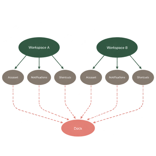
The interface cues are deliberately blunt. Distinct window borders, account avatars pinned in consistent positions, and workspace names held in the title bar all exist for one reason: to answer the question which identity am I speaking as right now before the user hits send.
Workspace HygieneGive each account a visually distinct avatar before you add the second workspace, not after. Border color and position are strong signals, but a face or logo is the one cue readers process without looking.
Letting Notification Center Carry the Alerts
Neither app draws its own pop-ups. Alerts route through the macOS Notification Center using the native PushKit framework, with payload delivery landing inside a 50 to 120 millisecond window. The practical consequence is that every tool a Mac user already owns for taming alerts works here without translation.
Focus modes, scheduled summaries, per-app banner styles, Do Not Disturb overrides: all of it applies. There is no second set of switches buried in an app preference pane to keep in sync with the system.
The ceiling on that integration is the operating system itself. Granular Focus mode filtering of specific workspace alerts depends on running macOS 12 Monterey or later; earlier versions lack the API hooks required for application-specific status bridging, so a Mac stuck on an older release gets all-or-nothing filtering. Readers on long-lived hardware should check their system version before planning a filtering strategy around workspaces.
Tuning the alert style
Three dials cover most of the problem. Banners appear and dismiss themselves, which suits Basecamp activity that deserves awareness but not interruption. Alerts persist until acknowledged, a reasonable choice only for the HEY Imbox if screening is part of a daily routine rather than a constant one. Badges carry a count on the Dock icon and cost nothing in attention until the user chooses to look.
Deep work sessions survive longest when badges stay on and alerts step down to banners. The count waits. The interruption does not arrive.
Command-K and the Economics of a Two-Key Chord
The quick switcher is the single highest-leverage binding in either application. Invoking Command-K collapses navigation that would otherwise take three to four cursor interactions into one two-key chord, then a few typed characters. Over a day spent hopping between projects, the saving compounds past convenience into a different working rhythm.
In Basecamp, the switcher is how a user reaches a specific project, message board, or to-do list without touching the sidebar. In HEY, keyboard flow carries the screening and composing loop, which is where the app spends most of its interaction budget.
The design logic here is continuity. Single-key shortcuts mirror the web application, so muscle memory built in Safari transfers to the wrapper intact. Window-level behavior layers standard Mac modifiers on top: Command for application actions, Command-W to close, Command-comma for settings that the system genuinely owns. Nothing is reinvented, and nothing fights the platform's conventions.
Chord Before CursorSpend one week forcing Command-K instead of the sidebar. The switcher only pays off once recall beats scanning, and recall takes about that long to build.
Open System Settings and Kill the Sound
Here is the configuration change with the largest return per second invested.
Open System Settings on the Mac. Go to Notifications. Scroll the application list until Basecamp and HEY appear, and open each one in turn. Leave Allow notifications on. Set the alert style to Banners. Then switch Play sound for notifications off for both.
The reasoning is well understood by anyone who has lost an afternoon to a chime. Audible interruptions during deep work carry a context-switching recovery cost that typically spans fifteen to twenty-five minutes, while a silent banner delivers the same information on the user's own schedule. Visual awareness stays. The yank out of flow goes away.
What Changes TodaySilent banners plus Dock badges give a full picture of pending work without a single forced interruption. It is the closest thing to a free attention upgrade available in a native wrapper.
Do it now, before the next notification arrives: open System Settings, find both apps under Notifications, and turn the sound off while the banners stay on.








Comments
No comments so far.
Join the Discussion