Executive Summary
Apple's visual language has steered web UI trends since the original OS X Aqua interface landed in 2001 — more than two decades of one company setting the default for what "polished" looks like on screen.
When a design team audited a backlog of redesign requests across client projects, a pattern surfaced: nearly everyone asked for "that Apple look," but almost no one could say which decade of Apple they meant. Aqua's gloss? The leather of early iOS? The bone-flat surfaces of iOS 7? The frosted depth of Big Sur? They're all Apple, and they all contradict each other.
The arc runs like this. Skeuomorphism taught a generation how to touch a screen, then collapsed under its own visual weight. Flat design answered with brutal minimalism and accidentally stripped away the cues users relied on. Glassmorphism and spatial UI now represent a more mature middle ground, restoring depth without the cost of fake leather and brushed steel.
One boundary worth naming up front: this trend analysis reflects consumer-facing product design. Enterprise dashboards and data-dense admin tools followed these cycles years later, if they followed them at all.
The Skeuomorphic Foundation
Early iOS and Mac OS X leaned hard on the physical world. Leather stitching in Calendar. Brushed metal in QuickTime. Glass shelves in Game Center. The interface borrowed from objects people already understood because the interaction model — tapping glass with a fingertip, was genuinely new and needed teaching.
That pedagogy was the point. A button that looked pressable invited a press. A switch that looked like a physical toggle told you it flipped. For a device with no instruction manual and no precedent, real-world metaphor was the fastest path to comprehension.
Web designers took the cue and ran past the finish line.
Picking apart an early notes-style app clone shows where it went wrong. The leather-grain background alone was a tiled 240px image at roughly 80KB, and the team had stacked three separate inset shadows to fake a single stitched edge. Most of the page weight bought zero additional function. It just looked expensive.
The numbers from that era are unforgiving. Heavy texture skins between 2008 and 2012 commonly added somewhere around 150 to 400KB of background imagery per page, well before responsive image techniques were standard practice. Beveled button treatments routinely layered two to four box-shadow declarations to simulate one physical edge — a lot of CSS to imitate a bevel nobody asked for.
Skeuomorphism solved a real problem in 2008. By 2012 the problem was solved, and the textures were just bloat with good lighting.
The Flat Design Overcorrection
iOS 7 detonated the whole aesthetic in a single release. Overnight, gradients, bevels, and drop shadows became embarrassing. The industry pivoted, and it pivoted fast: the flat transition concentrated into roughly two years following the mid-2013 mobile OS overhaul, after which the broader web tooling ecosystem caught up.
The correction was needed. The overcorrection is the story.
In stripping away texture, the web design community also stripped away affordance — the visual cues that quietly tell a user what's clickable, what's elevated, what responds to touch. Shadow and gradient utilities got deprecated from internal style guides in the years after 2013, and with them went the language of depth.
The consequences showed up in testing rooms. During one usability review, five testers in a row tried to tap a plain label that wasn't a button, then ignored an actual button styled as plain blue text. That session made the case better than any slide deck could: flat had gone too far.
On the fully flat build, tap-target hesitation appeared in roughly one in six first-time testers, concentrated almost entirely on text-styled interactive elements. Call it flat fatigue — the moment when minimalism stops clarifying and starts hiding the controls.
What flat got right
Performance, mostly. The death of 80KB leather tiles was a genuine win for load times and maintainability. The mistake wasn't flatness itself; it was treating depth as decoration rather than information. Depth communicates hierarchy. Remove it entirely and you remove a sentence the interface was speaking.
The Glassmorphism Era and Spatial UI
Depth came back, but it learned manners.
The desktop revival arrived around the 2020 macOS visual overhaul, and spatial computing pushed it further by late 2023. Instead of fake leather, the new vocabulary is light: background blur, translucent layers, and a hairline border that catches an edge. Glassmorphism establishes hierarchy the way frosted glass does in the physical world — you see that something sits in front of something else without needing a heavy shadow to announce it.
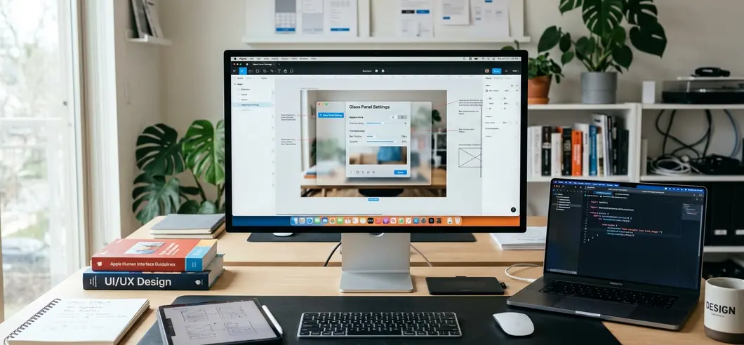
Under typical conditions, a glass panel uses a backdrop-filter blur between 12 and 20px, a translucent fill at 6 to 12% opacity, and a 1px hairline border at higher opacity to define the edge. Three small declarations, no image assets, all GPU-composited.
The naive implementation bites, though. An early attempt applied blur to a full-width sticky navigation bar floating over a scrolling image gallery. On mid-range Android devices the scroll jankered badly, because every frame forced the browser to re-blur the moving content beneath. The fix was unglamorous: toggle the blur only when the header actually overlapped content, using an intersection observer, and leave it solid otherwise.
One caveat carries real weight. The backdrop-filter property still demands a fallback solid background. In unsupported or performance-throttled contexts, the panel renders fully transparent — and your text disappears into whatever's behind it.
For the canonical reasoning behind Apple's depth and materials, Apple's Human Interface Guidelines remain the clearest primary source.
Why True Apple Design is About Restraint
Here's the trap most teams fall into: they decide that copying Apple means putting frosted glass on everything. Header, sidebar, modal, card grid — blur it all.
That reading misses the actual lesson. Apple uses these effects sparingly, to signal elevation and context, not as a blanket coat of paint. The blur tells you a layer is floating; if every layer floats, none of them do. Restraint isn't an aesthetic preference at Apple. It's how the depth stays legible.
The cost of ignoring this is measurable. Grading a client site that had applied frosted glass to its header, sidebar, modal, and card grid simultaneously, profiling on a four-year-old laptop showed the compositor struggling to hold frame rate. Stacked blur layers compound expensively: each additional backdrop-filtered surface forces its own offscreen pass, so four simultaneous glass panels cost far more than four times a single one.
Accessibility takes the second hit. Translucent text overlays frequently fail WCAG contrast unless the underlying fill opacity is raised to somewhere around 70 to 80% against busy backgrounds — at which point you've lost most of the glass effect you were chasing anyway.
When glass is the wrong answer
Restraint resists linting. You can't write a rule that flags overuse, because the same blurred panel that reads as elegant on a marketing page can read as cheap on a productivity tool, where users want flat, fast surfaces and nothing standing between them and their work. Context decides, and context is a judgment call.
The throughline across twenty years is consistent. Apple's best decisions weren't about texture or flatness or glass. They were about using exactly as much visual information as the interaction required — and not one shadow more. Superficial imitation copies the finish. Real influence copies the discipline.


Comments
No comments so far.
Join the Discussion