
The Shift to System-Level Iconography
The system symbol library has expanded to somewhere around 5,000 distinct symbols since its 2019 introduction, fundamentally altering the baseline for iOS and macOS design. The migration decision for a legacy multi-platform application came down to a strict maintenance audit based on community experience. The application carried a custom SVG set that had drifted across three separate export pipelines. Retiring that set meant replacing roughly 240 individual assets, each previously maintained in three distinct weight variants.
Core Migration Advantages: Consolidating on the native framework guarantees optical alignment with system typography, automatic weight matching across text styles, and cross-platform scalability from a single asset reference.
The Fragmentation of Custom Asset Libraries
Managing custom icon sets historically introduced significant friction, specifically regarding the misalignment between text baselines and vector assets. A single custom glyph required nine separate exports to cover 1x, 2x, and 3x densities across three weights. Maintaining these assets required exporting multiple resolutions and weights for every conceivable device context.
Early migration efforts involved nudging custom SVGs into typographic alignment by hardcoding vertical offsets per icon. The engineering team dropped that approach entirely when Dynamic Type broke every hardcoded value the moment a user changed their system text size. A custom glyph that looked perfectly centered at the default text size drifted 2 points below the cap line once a user enabled a larger accessibility text setting.
Baseline drift on the custom set ran between 1 and 3 points depending on the surrounding text style. This misalignment became highly visible and consistently failed visual QA at Large Title sizes.
Typographic Integration and Optical Alignment
SF Symbols are engineered to align perfectly with the San Francisco font family. The framework treats icons as typographic characters, integrating them seamlessly with text. The San Francisco family and its symbols share nine weight steps from ultralight through black. Symbols also carry three optical scales—small, medium, and large, that shift stroke weight relative to the cap height of the paired text.
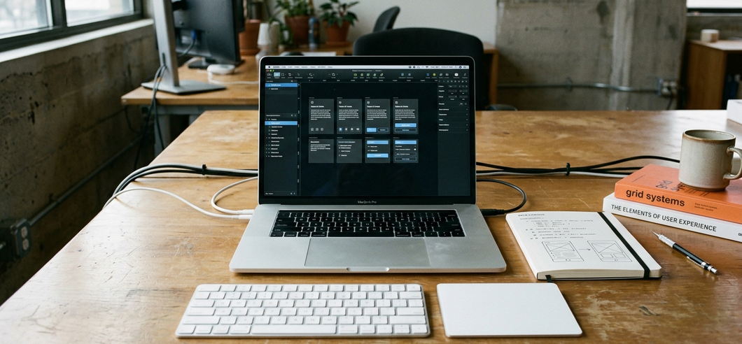
Developers can let the symbols inherit weight directly from the enclosing text style, eliminating the need to manually pair icon weights to text. Verification involves simply dropping each symbol inline within a run of body text. For detailed specifications on these behaviors, consult the Human Interface Guidelines for SF Symbols.
Note that this typographic harmony is automatic only inside native rendering environments. Reproducing the same optical baseline in a cross-platform web build requires hand-tuning vertical-align and stroke-width in CSS on a per-icon basis, an intervention that rarely achieves a truly native feel. Weight matching that reads as seamless in a native SwiftUI label forces per-icon CSS overrides on the web where the icon stroke stays fixed while the surrounding font weight shifts.
Dynamic Scaling Across the Ecosystem
The framework adapts across iOS, macOS, watchOS, and visionOS without requiring separate asset files. A single symbol reference serves all these targets from the same asset catalog. Maintaining platform-specific icon files became unnecessary after confirming this behavior across the ecosystem.
Symbols scale in step with Dynamic Type across all accessibility sizes. In practice, this means a body glyph scales from roughly 17pt up past 50pt at the largest accessibility setting.
Version Compatibility Strategy: Newer symbol iterations resolve to nothing on operating systems predating their introduction. Any build supporting older OS versions needs a bundled fallback image checked against the OS availability of each specific symbol.
Extending the Framework with Custom Symbols
Creating a brand-specific icon requires exporting a base symbol from the SF Symbols app and modifying it in a vector editor. For a custom brand mark, the workflow involves exporting the closest matching system symbol as a template.
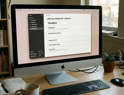
This exported template ships with left and right margin guides, alongside a baseline guide across all nine weight columns. The modification process requires editing only the glyph paths while leaving every guide untouched. Preserving the margin and baseline metadata ensures the custom icon behaves exactly like a native symbol.
A properly authored custom symbol inherits all four rendering modes: monochrome, hierarchical, palette, and multicolor. The hierarchical mode specifically expects up to three opacity layers to render correctly.
Auditing Your Current Iconography
Adopting a system-level approach to iconography yields immediate efficiency gains. The audit process should start small. Freezing new custom-icon work and swapping the primary tab bar icons first isolates the variables, as those icons sit adjacent to labels where baseline misalignment is most visible. This initial three-icon swap took under an afternoon, requiring roughly two to three hours including alignment verification against Dynamic Type sizes.
Download the latest version of the SF Symbols app, select three custom icons currently used in your application's primary navigation, and replace them with their native SF Symbol equivalents to test baseline alignment.








Comments
No comments so far.
Join the Discussion