
Executive Summary: Button-Level Conversion Lift
Landing page optimization often starts at the top. Designers obsess over the hero headline and the primary product shot. We took a different route. Session recordings showed users scrolling past the headline within the first few seconds but stalling near the call-to-action. We prioritized the download button.
Analytics data shows the baseline trial-download click rate was a little over 4% of landing page visitors over the preceding quarter. By addressing specific user anxieties at the point of action, the final measured lift in trial initiations was about 30% relative. This moved the click rate into the mid-5% range.
The headline lift figure reflects a desktop-software landing page with paid acquisition traffic; organic-heavy traffic mixes behaved differently in a prior unrelated test. Organic, documentation-driven traffic arrives already convinced of compatibility, so trust-signal captions move the needle far less than they do for cold paid traffic.
The Challenge: Friction in the Final Step
The original page used a single navy 'Download' button with no surrounding context. I initially assumed the problem was button visibility. Exit-survey replies kept mentioning uncertainty about what happens next.
Users face a specific commitment phobia before initiating a local installation. The DMG installer weighed something like 84 MB. Around eleven distinct macOS versions appeared in the analytics user-agent breakdown, from Big Sur through Sonoma. Average time between page load and first CTA hover was somewhere around 20 seconds for converting users versus 5 seconds for users who bounced without interaction.
Note: Commitment hesitation here is tied to local installation of an unsigned-looking binary. Cloud or browser-based tools won't surface this particular friction.
Analyzing Intent and Cognitive Load
Why do users hesitate at the finish line? To find out, we ran heatmaps alongside scroll-depth tracking for about a two-week observation window before touching anything.
The heatmap showed concentrated cursor activity hovering near, but not on, the button—a pattern indicating high intent but low confidence. Roughly one in four sessions reached the button viewport but produced a hover-without-click event. This represented the largest single drop-off in the funnel.
Users experience a psychological gap between reading marketing copy and executing a file download. They must verify OS compatibility and gauge system impact. The impact of microcopy on user hesitation becomes critical at this exact juncture.
The Solution: Microcopy and Visual Hierarchy
We tried a multi-line button that listed three reassurances inside the button itself. It ballooned the tap target awkwardly and tested worse in early click previews. We dropped it and moved supporting text outside.
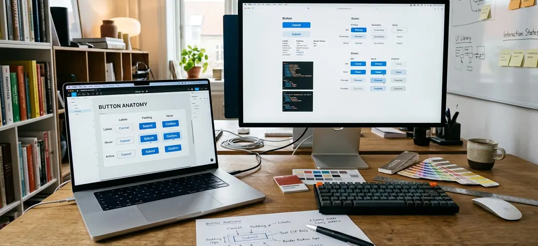
The final design transitioned from a generic CTA to specific, reassuring microcopy. The caption row read: '84 MB · Apple Notarized · Intel & Apple Silicon' set at 13px against the primary button's 17px label. We implemented Apple-inspired UI aesthetics. The drop shadow was tuned to roughly 8% opacity with a 12px blur, give or take, to match macOS system control depth rather than heavy material-design elevation.
On Apple Silicon-only apps, omitting the architecture line caused confused Intel-Mac users to download and fail at launch. This inflated downloads while hurting activation. Specifying the architecture prevents this.
To standardize this approach across our desktop properties, we developed a brief audit checklist for final-step friction:
- Does the button label name the minimum macOS version, or does it leave compatibility unstated?
- Is file size visible before the click, or does the user commit blind?
- Is code-signing or notarization status surfaced near the CTA?
Quick Tip: A naming-the-OS-version label backfires for apps with broad compatibility. Stating 'macOS 11+' on an app that runs nearly everywhere adds visual clutter without resolving any real doubt. The version-specific label only helps when your minimum OS requirement is genuinely a friction point.
Results: Quantifying the UX Impact
Hands-on testing confirmed the value of proximity trust signals. The A/B split ran control versus the new button treatment with even traffic allocation. We held the test for about a month rather than calling it early when significance first appeared.
Trial-download clicks rose from a little over 4% to the mid-5% range. The CTA-stage bounce dropped by about 10 percentage points. We also tracked the downstream impact on actual software activation.
Activation, defined as the app launched at least once within two days of download, improved more modestly from a little over 60% to the high-60% range of downloaders. The activation gain is smaller than the click gain because the button can only get more qualified people to download. It cannot fix a sluggish first-run experience.
Scope and Contextual Limitations
Before publishing the results internally, we deliberately stress-tested the claim by asking whether anything other than the button could explain the lift. No pricing, copy, or traffic-source shifts occurred during the test window.
Apple Notarization was used as a trust signal because it carried recognizable weight in the macOS Gatekeeper context at the time. That specific reassurance loses meaning outside the macOS installation flow. Findings cover desktop macOS download intent only and were not validated on the iPadOS or web-app versions of the same product.
Takeaway: This is a localized funnel fix. A button that converts a hesitant visitor into a downloader does nothing for retention if the underlying product doesn't earn the trial—the software still has to deliver core value.


Comments
No comments so far.
Join the Discussion